N26
Project Overview
This personal project was developed as an assignment under the guidance of Aela MID (Master Interface Design), and the company chosen was the digital bank N26 and their Customer Service Support.
What's this project for?
The prompt was to improve the user experience and design interface of the support page optimizing users' engagement and aiming their needs. This project should suit web standards with no responsiveness or any concern about mobile requirements.
Features designed
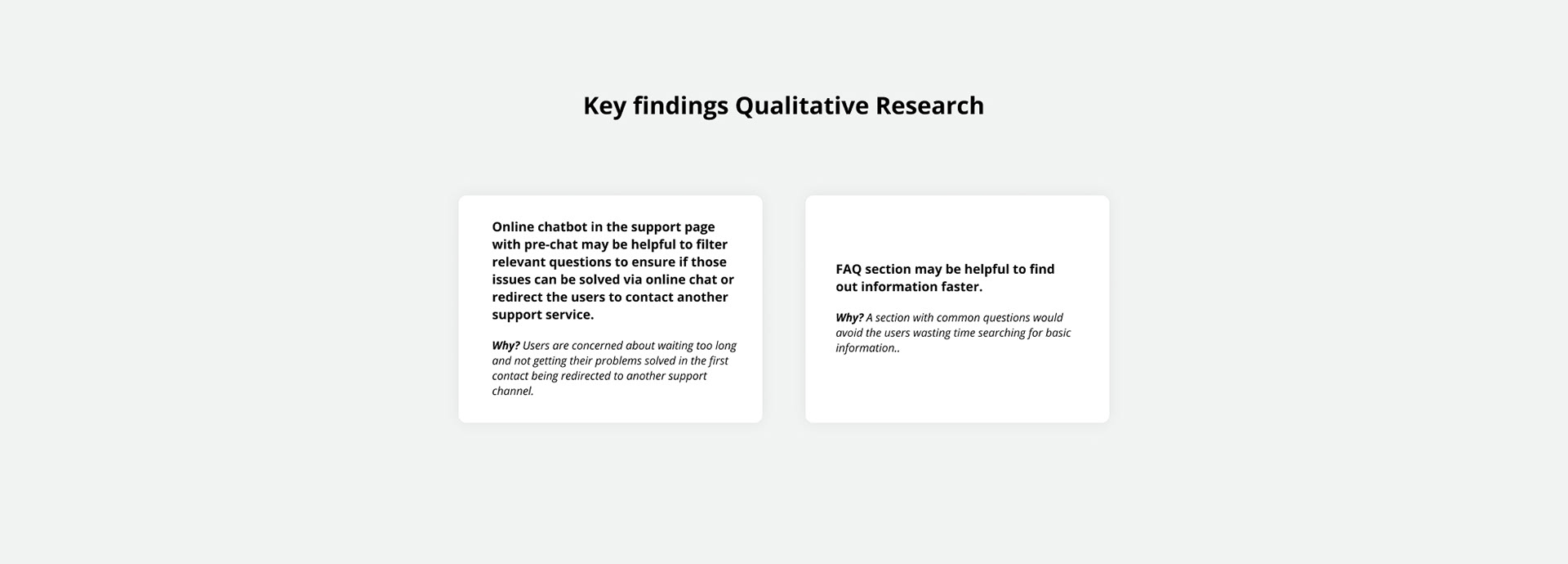
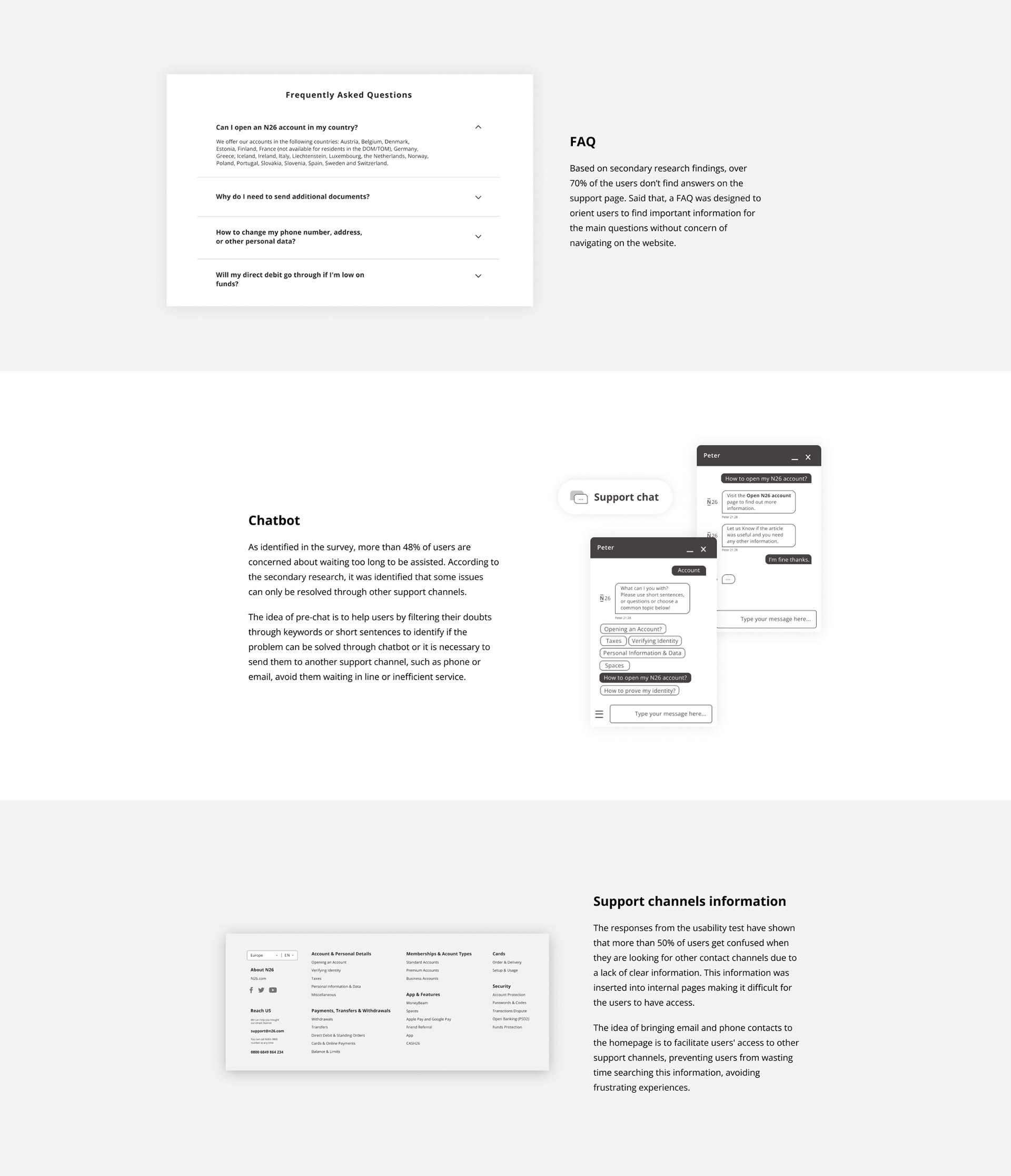
- FAQ section
- Chatbot implementation home page
- Support channels information home page
Role:
UX / UI Designer
UX / UI Designer
Responsibilities:
• User Research
• Usability Test
• Personas
• Competitor Analysis
• User flow
• Wireframes
• High Fidelity Prototype
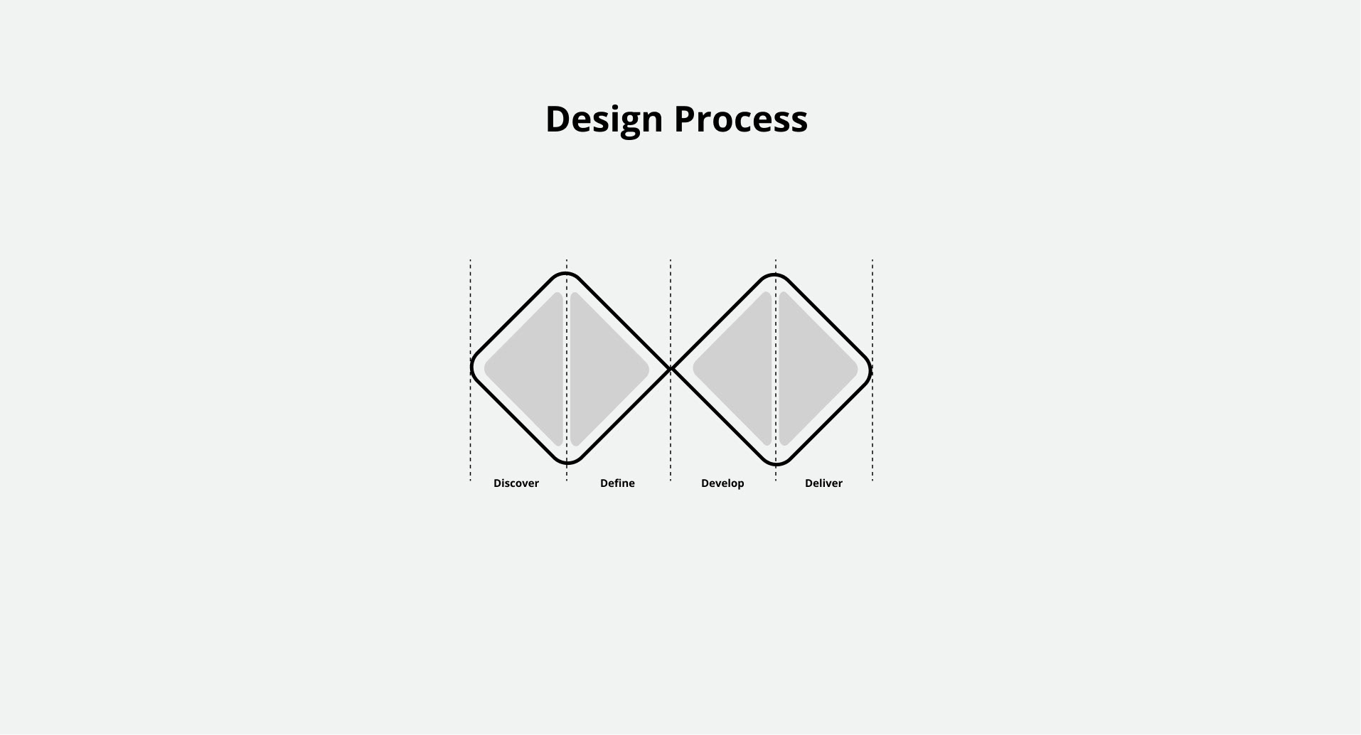
Discovery
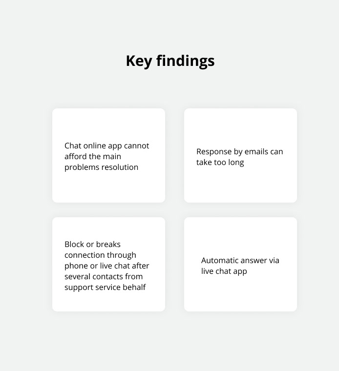
Initially, I started collecting data by doing desk research in order to gather as much information as I was able to find about the company, products, customers, and main competitors. Desk research gave me the first clue about some issues that the company's customers may have been struggling with in Customer Service Support.
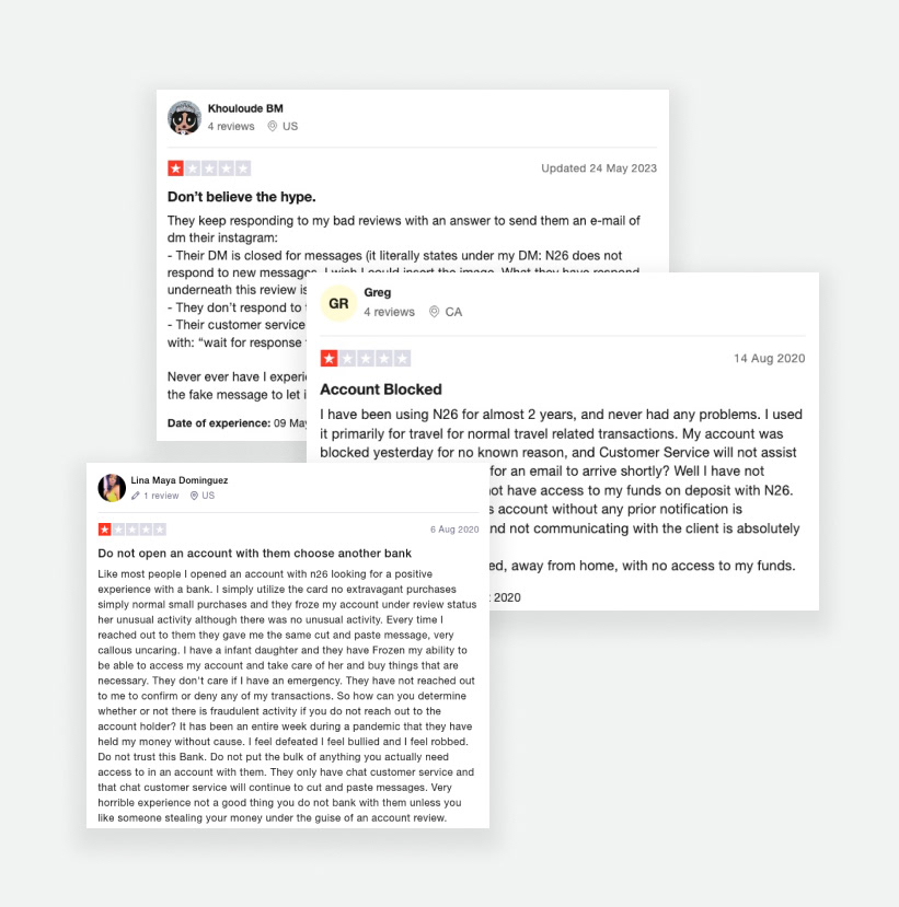
The website Trustpilot was the main source to analyze customers' complaints and how users were dealing with their issues.
______________________________________________________________________________________________________________________________________________________
Based on the desk research, it was revealed some issues that customers have been dealing with. These findings gave me a clue about which path and methods I should take on it.
______________________________________________________________________________________________________________________________________________________
Quantitative research
Next steps I conducted Quantitative Research in order to learn more about the users by having accurate data, and a Moderated Usability Test on the current support page guided me to comprehend users' behavior. It also helped me to validate my assumptions with users avoiding any biases I may have.
Target
- People who have a digital bank account as a second option to accomplish daily or occasional transactions.
Objective
- Collecting data from people who have digital bank accounts.
- Understanding users' preferences and pains while they are contacting customer service support.
- To see which services available are the most used and the main reasons to use them.
Form: A form was sent through Google Forms and a total of 50 people were invited, and 47 responses were collected. See below the main topics highlighted by interviewers.

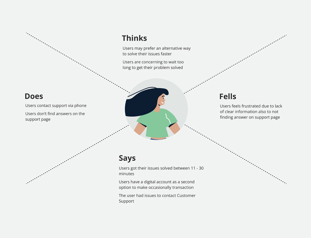
Empath Mapping
I organized the data from research in Empathy Mapping to identify users' thoughts and feelings regarding the issue I was tackling with.
______________________________________________________________________________________________________________________________________________________
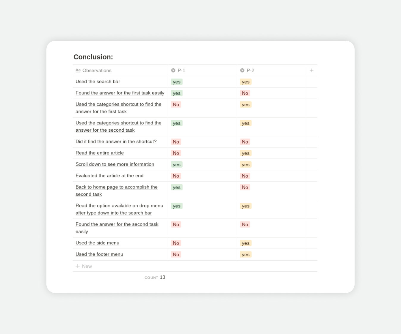
Moderated Usability Test
Based on outcomes from quantitative research I've decided to roll up a Moderated Usability Test to analyze users' behavior while they are interacting with Customer Support Page to identify pain points, and also to confirm my hypotheses.
Objective
- Analyzing user's behavior during the test accomplishment.
- Identifying any pain points during the test.
- To see how efficiently participants can complete the task requested.
- Identifying any unhappy moments while accomplishing the task.
Tasks
- What is the maximum amount of money to do a top-up monthly?
- How do I unblock my account?

Personas
At this stage, the data from users gave me a few insights about how I could solve these issues. I have developed 3 personas with different backgrounds that represent a wide range of people who's been interviewed. These personas have guided me to understand the context, make decisions and keep the end-user always in mind.

Competitor Analysis
I have done a benchmark to compare some of the main competitors to gather insights to boost the interface enhancing the final results. Find the design competitor analyses on Miro.

______________________________________________________________________________________________________________________________________________________
Time to draw some ideas
I created a mood board to inspire me with a few references related to design, shapes, and colors. As the initial prompt was to only redesign the Support Page, I couldn't go too far from the design guidelines already existing. I have drafted some concepts on paper before putting them on digital.
Scribbling ideas on paper helps to avoid time wasted and unnecessary pixel-perfect details that I shouldn't be bothered with as a digital version may offer. Once I got it done on paper, I started to digitalize my wireframes. Check out the wireframe and mood board developed in the links below.
______________________________________________________________________________________________________________________________________________________
Delivery
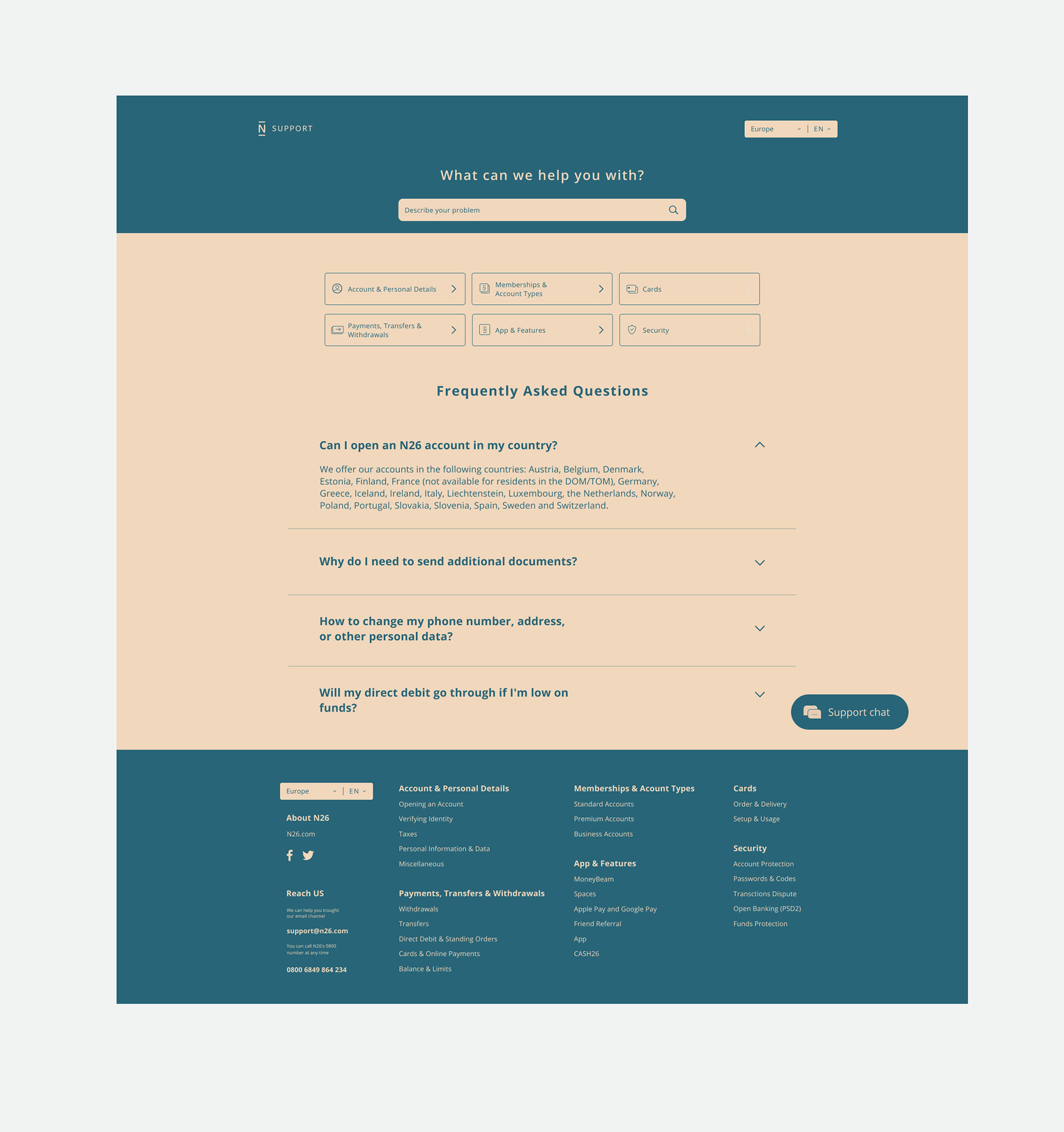
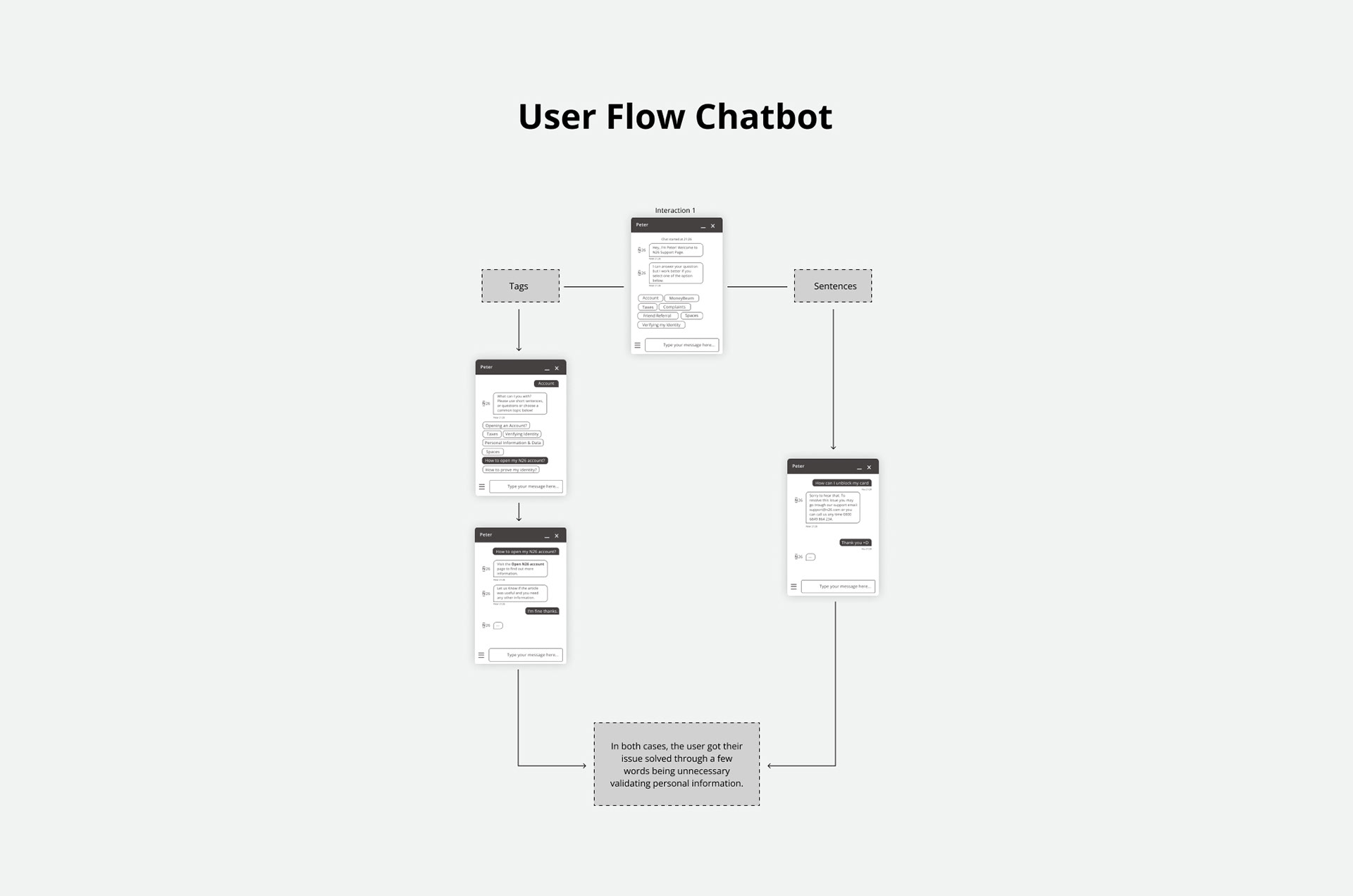
It's done! After several attempts and adjustments, the design is fresh out. Following the design guidelines to not miss the references, the idea suggestion attends to the user's needs discovered during the process. As the idea suggestion includes a new feature designed that was not available in the previous version, I have also designed a User Flow related to this feature. See below the final outcomes.

Site composition design
Find below the details and main reasons for features designed in this project that wasn't available in the previous version.
- The Moderated Usability Test clearly translated users' behavior while they were interacting with the product. Applying the test helped to avoid time wasted and the biases I had.